

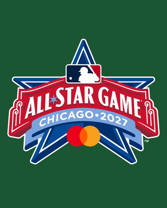
Major League Baseball formally introduced the league’s next All-Star Game host, the Chicago Cubs, and unveiled the event’s official logo at a press conference at Wrigley Field on July 18th.
I was apprehensive when I first saw the design. It felt a bit cookie-cutter. But it’s growing on me. The logo looks better in full color. It’s more detailed than I had realized from the video.
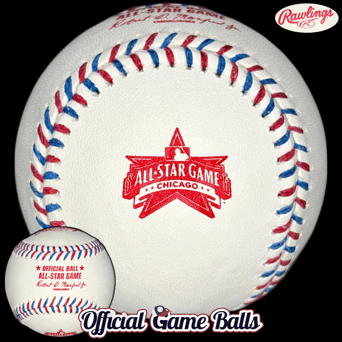
In a bit of a surprise, these Chicago All-Star Game baseballs were also displayed and available at the event (in very limited quantity, we’ve heard). Does this convey Wrigley Field or Chicago Cubs to you?
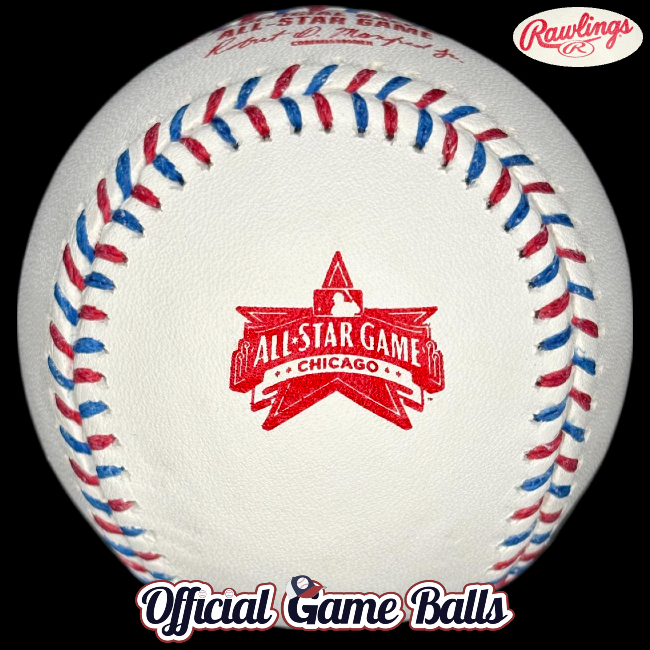
Unfortunately, they don’t use multicolored ink stamping on the official All-Star Game balls. I don’t think the monotone version is doing the original design any justice. The red stamping and red and blue laces just look too similar to this season’s Philadelphia ASG ball, in my opinion. It’s more obvious when they’re displayed next to each other.
But something else is off… something is suspiciously missing from the baseball’s commemorative logo and its center panel league stamping. Can you spot it? Take a closer look:
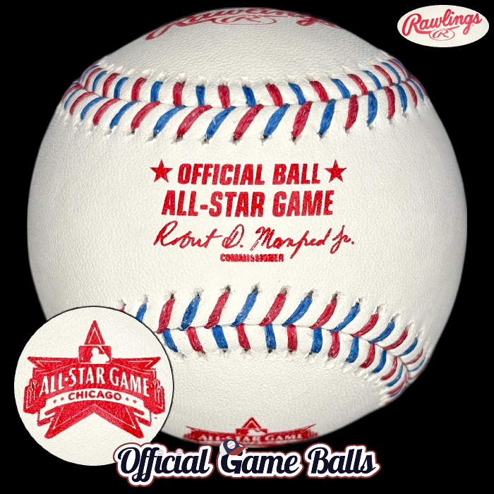
“Once you don’t see it, you can’t unsee it.”
—Yogi Berra, probably
There’s no 2027! Why? For the time being, we’re considering these to be promotional “event announcement baseballs.” That certainly can’t be the on-field model for game use, right? Fingers crossed that the final uses proper Cubbies-blue ink, similar to the game ball from the 1990 Midsummer Classic. Since the logo’s base is inspired by the “famous red marquee over the home-plate gate to Wrigley Field,” red ink does make some sense.
I don’t want to speculate here why “2027” was left off the ball entirely. I will choose to live in the moment and hope all the All-Star Week festivities take place next season, and that this game is played as scheduled.
More Commemorative Game Ball News
We’ve got our first true surprise for 2026. There will be official, specially stamped game balls used for the New York Mets 1986 World Series 40th Anniversary Reunion & Celebration August 1st and 2nd! Two chances to come away with one of these sweet game-used gems:
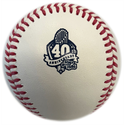
How about that logo?! Credit: we stole this image from Major League Baseball and the NY Mets and/or MLB Auctions, so you may steal it from us.
You can reserve a game-used ball from the Mets if they’re not sold out yet (gameusedATnymetsDOTcom). I have not heard if these will be sold via retail new/cubed.
We had this Mets event noted back in January, in our wishlist and 2026 official game ball season preview post. So not a total shock. But we had nearly forgotten. I wasn’t tipped off about these baseballs until last week. This is a rare win for our “On the Radar” section, buried at the bottom of our pinned 2026 Rawlings MLB Live Tracker post.
So, for the hell of it, let’s hope resharing that list scores collectors a few more 2026 commemoratives:
ON THE RADAR: 2026 Events with Special Game Ball Potential
- Atlanta Braves Andruw Jones MLB Hall of Fame Celebration Game July 30th (We should have seen something by now)
- Chicago White Sox Ozzie Guillen “13 Forever” Jersey Number 13 Retirement Ceremony, Aug. 8 (Ditto)
- Las Vegas/Sacramento/Oakland/KC/Philadelphia Athletics A’s 125th Anniversary Celebration Game Aug. 12 (No way)
- MLB Field of Dreams Game Minnesota Twins vs. Philadelphia Phillies Aug. 13
- MLB Little League Classic, Bowman Field, Williamsport, PA, Atlanta Braves vs. Milwaukee Brewers Aug. 23
- Colorado Rockies Hall of Famer Larry Walker Coors Field Statue Unveiling Aug. 23 (replica statue unveiled!)
- 2026 San Francisco Giants Jeff Kent Number Retirement Game Aug. 29 (Likely)
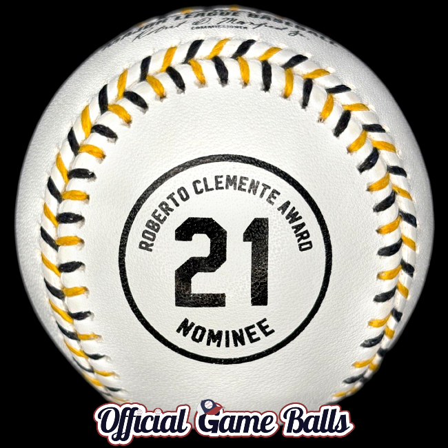
- 2026 MLB Roberto Clemente Day Sept. 15
- New York Mets Carlos Beltrán #15 Jersey Number Retirement Ceremony Sept. 19
- Colorado Rockies Todd Helton Coors Field Statue Unveiling Sept. 19 (replica statue!)
- St. Louis Cardinals 20th Anniversary of 2006 World Series Champs
- Arizona Diamondbacks 25th Anniversary of 2001 World Series Championship, Celebration Sept. 19
- Minnesota Twins 35th Anniversary of 1991 World Series Championship
- New York Yankees CC Sabathia Number #52 Retirement & Monument Park Induction Sept. 26




Great article!
Very entertaining.
Thanks, mom!