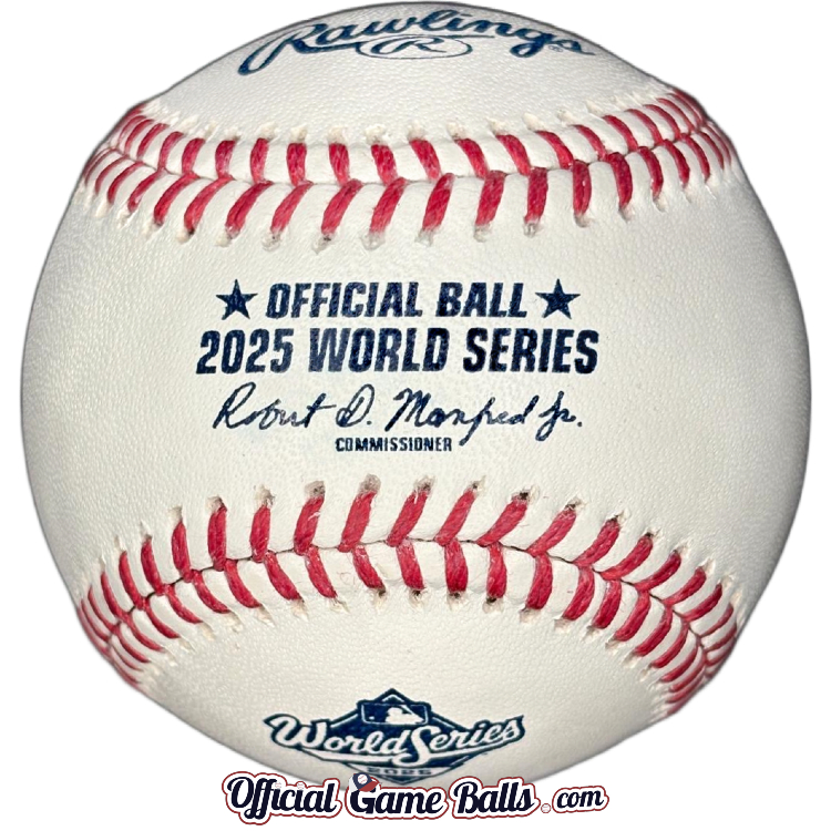
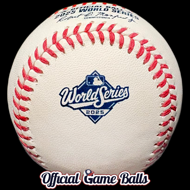
We’ve got our first look at the new World Series game balls this past weekend. We only have mockups to share below, the game balls apparently are still being stamped at the Rawlings factory. With such a busy year for commemorative logo official game balls, I can’t say I’m surprised they’re not already available for sale. It’s the latest I can recall a World Series baseball being unveiled, and released and stocked.
We’ll keep this short and just share the artwork without much added commentary. But I can’t help it, I must share a few thoughts after the reveal:

If you’ve seen the primary 2025 Fall Classic logo with the Capital One logo added, and felt disappointed—I think you’ll appreciate this sponsorless version a bit more. I feel it’s much improved. It looks complete and balanced now, with a finished baseball diamond base. It’s simple, but a classic design.
Long-time collectors should be reminded of the heyday of red and blue stamped World Series official game balls. That cursive font has been sorely missed, and it’s great to see it again! I believe it’s a new, custom variation of the three script styles from the 1980s–90s.
We haven’t seen a cursive logo since 2000. The first iteration was stamped in 1987 on the ROMLB-WS baseballs used by the Twins and Cardinals, and ran through 1991. Have a look at our Museum of Baseballs World Series Gallery to compare. Does it remind you more of the original cursive design, or the second variation from 1992–1997? Or the final, 1998–1999? See if you can find elements from each variation in this new 2025 logo!
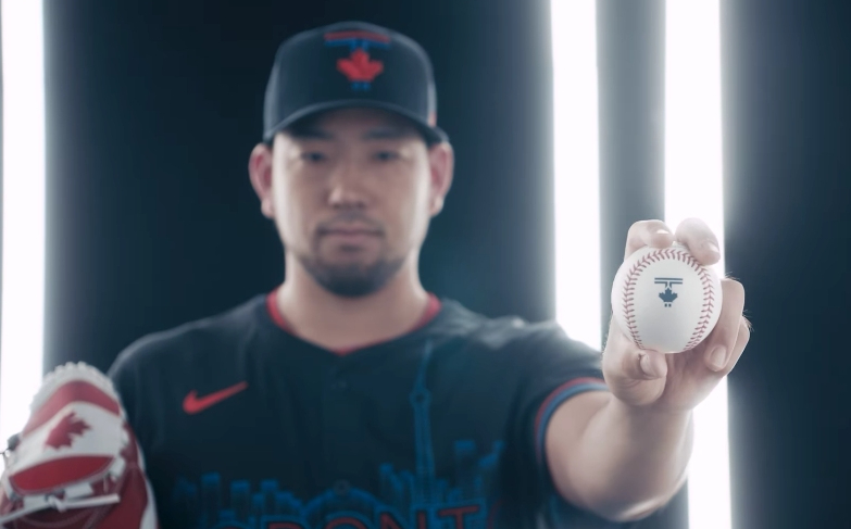
UPDATE: We’ve got the official 2025 World Series baseballs in-hand. And we posted live on the site just in time for Game 7 from the Rogers Centre in Toronto on Sunday Nov. 2nd. Phew! Be sure to check out the history of Major League’s official World Series game balls in the Museum of Baseballs. And for those who love weird and rare artifacts from America’s favorite pastime, see our giant gallery of MLB Prototypes, Samples Misprints and Error baseballs! Take your time and have a long scroll—you’ll discover many World Series baseballs and plenty of other oddballs that never quite made it to The Show.


Great article. It’s hard to believe it took until October for them to release these. I have a few thoughts as well. First, this design gave me deja-vu of the 2019 World Series, with the only exception being the changing of block font to cursive. Overall, I really like the change to cursive, but it feels that this logo is missing something. I would like to see them bring back “Fall Classic” on the logo like they did from 2010-2014. My personal favorite was the 2011 version. I think it would be interesting to see what others think their favorite version is?
Oh good call on the 2019 comparison. Oof I didn’t even notice, but it is essentially the same base logo. That shows how important a font is. 2011 was a great one! And 2013 with the pennants. I’m not sure I have a favorite though. I honestly really like the 1978-1999 runs despite the reptition. Maybe I’m just nostalgic. Also, all 3 of the years with the World Series trophy in the design stand out to me. I could envision a standardized logo featuring the trophy or pennants getting used for multiple years. And the 2001 – on-field game version with the banner – that really is a memorable mark.