
Nothing is official, but I’d bank on all of the following:
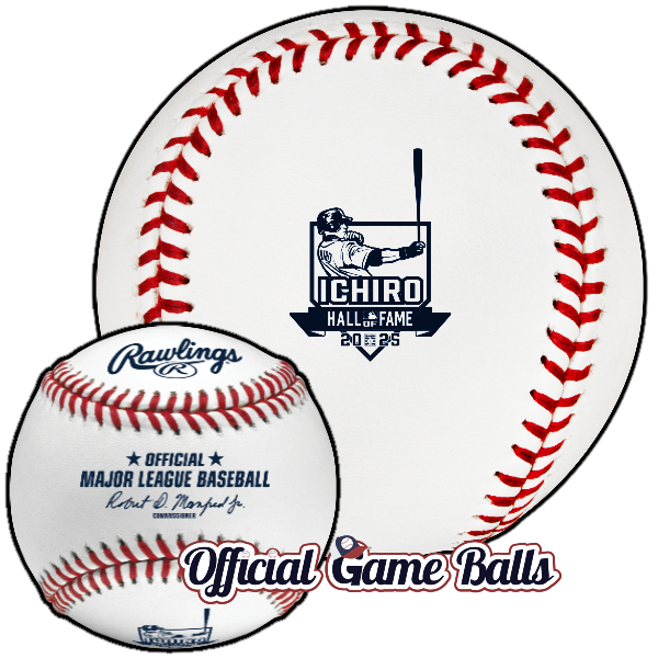
- Most collectors assumed there would be an Ichiro 2025 ball. They’re retiring Ichiro’s #51 jersey in this, the year of his Major League Baseball Hall of Fame Induction! We’ve been hinting about two Ichiro Suzuki commemorative logo baseballs all season. If you’ve been following along closely, you caught on. That’s a done deal. They’re awesome, we’ve got mockups below!
- There are a few surprises on the way, including one unexpected ball
being used tomorrow night (Friday, June 20th)available soon in the Windy City. Chicago Cubs or Chicago White Sox? Find out more below. - We’ve speculated there would be, or at least should be, a Bristol Motor Speedway commemorative game ball used on-field, in gameplay. An opportunity like that should be a no-brainer. But as we’ve mentioned in previous posts, if MLB can miss on the Rickwood Classic AND multiple Field of Dreams Game events—two league-wide celebratory and monumental national showcases that would have been a lock in the Bud Selig era—then they sure as heck can strike out in Tennessee… continued below…
- There might be another San Diego Padres ball on the way, because why wouldn’t there be?! If you read deep into our 2025 Live Tracker and Wishlist, you already knew.
- Last note, we’ve heard rumors of a special number retirement game ball coming in New York, and we still haven’t closed the door on a potential Detroit anniversary celebration.
Ichiro: Seattle has been rock solid for recognizing its legends with special event gamers. They might be the best in the league in recent seasons, dating back to those sweet, sweet Ken Griffey Jr. number retirement and MLB HOF induction baseballs.
Only one of these amazing baseballs is getting anointed as an official game ball—to be used in MLB gameplay. The other is only to be used for retail. Can you guess which is which? Regardless, I love both designs and anything Ichiro related is a must-have. To Mariners fans and ballhawks who are able to travel, there’s extra incentive to stay in Seattle all weekend: one of these baseballs will be used in all 3 Ichiro Suzuki weekend celebration games at T-Mobile Park, Aug 8–10. Good luck and happy snagging! Send us a gamer for the Museum galleries, please?!


Next up, the Chicago rumor. This materialized quickly, from out of left field:
From a Chicago Cubs press release and Fox 32 Chicago way back in January:
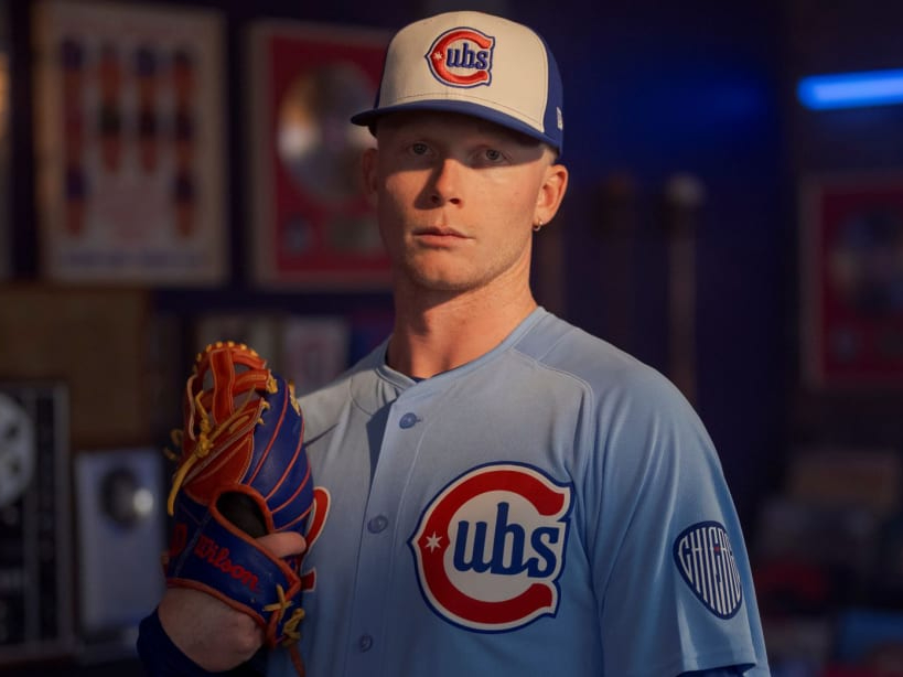
- The Cubs’ new Blues Alternate uniform, presented by Motorola Razr, celebrates both the team’s history and Chicago’s role in shaping the electric blues movement.
- The baby blue color scheme returns for the first time since 1981, debuting on April 5, and will be worn on Fridays throughout the summer at home games.
- The uniform features unique design elements, including a chest patch inspired by early Cubs uniforms, a guitar pick sleeve patch to honor Chicago’s blues legacy, and socks with a six-string guitar stripe, nodding to the anthem “Sweet Home Chicago.”
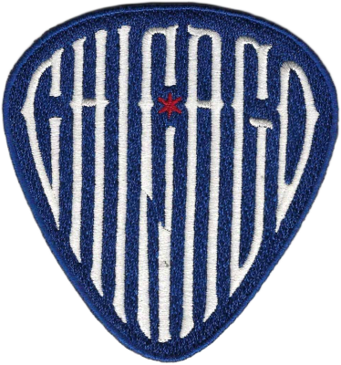
No mention of a game ball. But we can have a look at the unis and caps, and make an educated guess: The ball will feature either that slick new Cubs design above, or the guitar pick patch design? I really hope it’s not some new, lame wordmark nonsense. It’s gotta be the “Cubs” emblem on the left, that’s where I’d put my money. I think either would make for an excellent commemorative logo on the Major League’s official baseball, as long as it’s a large enough logo to see without a magnifying glass.
UPDATE: Some form of commemorative ball is happening, but apparently the baseballs used in the Cubs-Mariners game last night (Friday June 20th) were standard MLB baseballs. That’s based on just one screen capture from the broadcast sent to us by a reader. If true, I would not call this rumor busted just yet; they’re almost certainly coming to Wrigley sooner or later. The only questions: when, and will they be used in games, or retail only?
UPDATE JULY 1: Artwork just arrived in our inbox. Here are our mockups:


MLB Bristol Motor Speedway Game, Braves vs. Reds, Aug. 2nd in Bristol, Tennessee

No definitive logo or artwork has been shared with us, yet, but we’ve learned enough recently to call it confirmed. There sure as heck will be officially stamped special game balls in Bristol! Hallelujah.
But… will they be retail-only, or used on the racetrack… er baseball field? Rumor for now is: for retail purposes only.
I have no more information beyond a tip that a baseball has been greenlit for the event. And it’s going to be available from Rawlings shops & sellers.
UPDATE: Gentlemen, start your engines! Vroom vroom:


MORE NEWS ADDED (JUNE 20–31): We’ve seen a logo circulate for a Comerica Park 25th Anniversary celebration in July. We were told long ago nothing had been approved to commemorate the occasion by the Tigers—at least nothing in official game ball form. But it hasn’t been ruled out… It’s been ruled out—no Comerica 25th happened (Sad!). And finally, David Wright’s number five is being retired by the New York Mets in July. They’re also inducting the long-time third baseman into the team’s hall of fame. There should be a special gamer in use July 19th.
That should just about wrap up the rumor mill for June. Unless you want to subscribe to our newsletter and email update below? Then I’ll share one more with you. There is yet another San Diego Padres ball in the works to go long with their busy season of commemoratives. It’s going to recognize and celebrate the team’s SD Padres Hall of Fame in some way – perhaps just for signings/retail? Perhaps a 2025 induction ceremony? We don’t know yet. Sure, it’s not much to go on right now, and no logo to tease. But hey, it’s juicy game ball gossip. Isn’t that what we’re here for?!
Where else will you get exclusive insights like these? Please sign up by sharing your email below. No spam, no invasive tracking, no nonsense:


Even though MLB has overly implemented word-heavy templates the last few years, I think they did a decent job with The Bristol Speedway Classic. The subtle use of the checkered flag is a nice touch, as well as the slanted font commonly used in nascar which gives an illusion of movement. It would look great with black and white stitches to commemorate the checkered flag waved at the end of a race. My other recommendation would be to move the MLB batter-man logo from the top to the lower right, which is where the corporate sponsor logo was removed. This would balance out the logo nicely.
Brilliant idea! That’s the perfect nod to that timeless tradition. I’m also on board with moving the batterman logo, it does seem like random placement for it now.