Last Updated: October 27
Breaking news! New 2025 Rawlings MLB baseballs incoming! It’s the 2025 MLB Game Ball Live Tracker and OfficialGameBalls.com 2025 Wishlist! This list will be a work in progress throughout the season. What does that mean? It means we’ll include special baseballs that have already been used in games, plus upcoming 2025 games and events where balls have already been confirmed, or are nearly certain. And we’ll add some wishful thinking – unconfirmed opportunities that could feature a specially stamped commemorative ball—speculative baseballs.
Like our 2024 edition, we’ll be updating the post throughout the season. Will 2025 exceed last season’s incredible 32 official ROMLB special event logo on-field and promotional baseballs? Check back in the coming months to find out! (Can confirm: yes it will 😮)
Major League Baseball 2025 Rawlings Official MLB Game Balls
2025 Rawlings Official Game Balls for On-Field / Game Use (25 +3*)
- 2025 Rawlings MLB World Tour: Tokyo Series LA Dodgers Chicago Cubs Tokyo Dome, Japan March 18-19 (Check it out!)
- 2025 Rawlings San Diego Padres Opening Day Commemorative Logo Balls March 27th (Yup!)
- 2025 Rawlings San Diego Padres City Connect Baseballs (3/28 & most Fridays) (Confirmed!)
- 2025 Rawlings San Diego Padres Military Appreciation Day (3/30, most Sundays, Memorial Day) (Confirmed)
- 2025 Rawlings Houston Astros New City Connect Baseballs (3/31, 4/11-13, most Mondays) (Unveiled here!)
- 2025 Rawlings San Francisco Giants 25th Anniversary Oracle Park April 4th Opening Day (1 Game Only, Confirmed)
- 2025 Rawlings San Francisco Giants City Connect Baseballs April 8 (Confirmed)
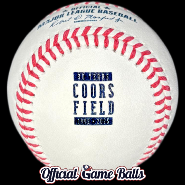
- 2025 Rawlings Colorado Rockies Coors Field 30th Anniversary April 26th (1 Game Only, Confirmed)
- 2025 Rawlings Miami Marlins City Connect Baseballs (5/3, Saturdays) (Confirmed)
- 2025 Rawlings Anaheim Angels City Connect Baseballs (Check it out)
- 2025 Rawlings Seattle Mariners City Connect Baseballs (Trident!)
- *3 2024-2025 Repeat Rawlings City Connect Baseballs: Phillies, Rays, Blue Jays
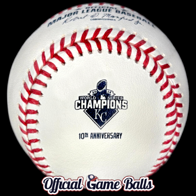
- 2025 Kansas City Royals 40th Anniversary 1985 World Series Champions May 16 (Confirmed gamer!)
- 2025 Kansas City Royals 10th Anniversary 2015 World Series Champions Weekend May 17 (Confirmed gamer!)
- 2025 Chicago Cubs “Blues Alternate” Jersey Baseballs July 4th (In use Friday home games. Details & Mockups. We got one!)
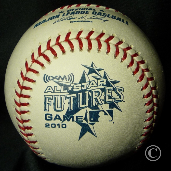
- 2025 Rawlings MLB All-Star Futures Game Atlanta Official Game Balls (Image here)
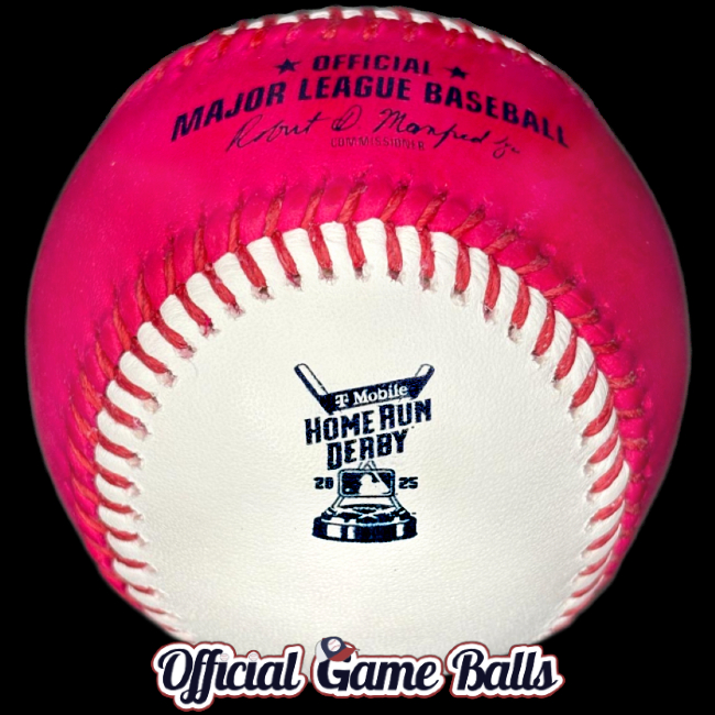
- 2025 Rawlings MLB All-Star Home Run Derby Atlanta Official Game Balls (Image here)
- 2025 Rawlings MLB All-Star Home Run Derby Baseballs Red MoneyBall Bonus Ball Atlanta (Image here)
- 2025 Rawlings MLB All Star Game Atlanta Braves Practice Red-Laced Dark Blue-Stamped (Confirmed. Image!)
- 2025 Rawlings MLB All-Star Game Atlanta Braves Truist Park, Red & Navy Blue Laced, Navy Stamped (It’s here! Read more…)
- 2025 Rawlings Philadelphia Phillies 2026 MLB All-Star Game Declaration Launch Party Official Game Ball! (Check it out!)
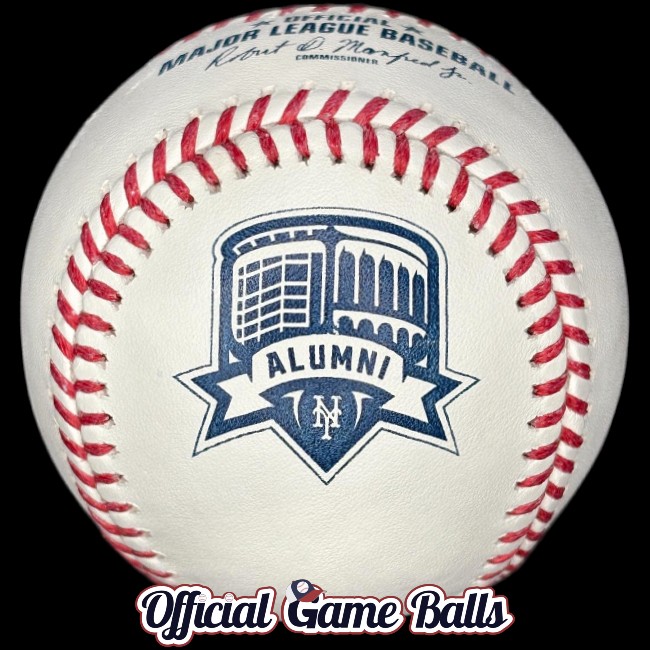
- 2025 Rawlings New York Mets David Wright #5 Retirement & Mets Hall of Fame Induction July 19 (Sneak peek)
- *2024–2025 Philadelphia Phillies Wall of Fame HOF Game & Alumni Weekend Aug. 1 (Repeat from 2024)
- 2025 Seattle Mariners Ichiro Suzuki #51 Jersey Retirement Weekend Aug. 8–10. ( Confirmed! Used Aug. 8–10! IMAGE)
- 2025 Milwaukee Brewers Bob Uecker Celebration of Life Aug. 24 (LIMITED! Game-use only, no retail. Image.)
- 2025 Baltimore Orioles 30th Anniversary, Iron Man Cal Ripken Jr. 2,131 Consecutive Games Streak Record 9/6 (Thank you, Rawlings!)
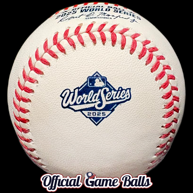
- 2025 Rawlings MLB World Series Baseball (Now in stock!)
2025 Rawlings ROMLB-Grade Retail & Promotional, & Miscellaneous Official Game Balls (36)
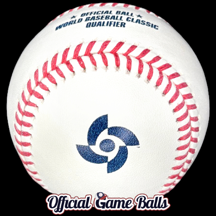
- 2025 Rawlings World Baseball Classic Qualifier Baseballs Taipei, Taiwan & Arizona (Confirmed, No retail)
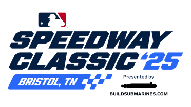
- 2025 Rawlings MLB Bristol Motor Speedway Game Atlanta Braves Cincinnati Reds Tennessee Aug. 2 (It’s happening! Retail only.)
- 2025 Seattle Mariners Ichiro Suzuki MLB Hall of Fame Celebration Aug. 8–10 (Retail only, but awesome!)
- 2025 Rawlings New York Mets Alumni Classic Game Sept. 13 Team Shea Stadium vs Team Citi Field Ball (Cool! Used in Exhibition)
- 2025 San Diego Padres Exclusive Padres Hall of Fame 2025 Commemorative HOF Baseballs (No Game Use? Image)
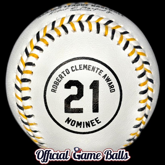
- 2025 Roberto Clemente Award Nominee Commemorative #21 Logo Baseball (EXTREMELY LIMITED for MLB Charities. Check it out!)
- *Preview: 2026 Rawlings MLB All-Star Game Official Game Ball, Philadelphia Phillies Host (Image)

The Rawlings MLB Team Series Collection
Thirty (30) official ROMLB baseballs featuring team colors! Check out the full collection now. There’s one beautiful multicolor laced, specially stamped ROMLB team logo baseball for every Major League Baseball team.
Full-sized, high-res images are available in the Museum of Baseballs photo galleries.


- April 1 Update: (no April Foolsing, I promise!) This is shaping up to be a busy season for official game ball collectors! We can announce
one and a half dozennearly 2 dozen event baseballs which will be used in games. And we’re sharing some other interesting developments, if you’re willing to scroll through the full post below. As for the rest of the speculative oddballs on this list? We’d at least hope they’ve been considered for game use or retail, however farfetched some may seem. If nothing else, we’re planting seeds for future consideration. - May 16 Update: Two baseballs we have had as probables on our 2025 game ball list for months have finally been publicized by the team. The KC Royals will indeed celebrate two World Series championship anniversaries this weekend. Check the On-Field Game Ball list below for dates, details and preliminary images!
- June 2 Update: There were addtional 2024 Rawlings MLB Lou Gehrig Day Baseballs signed and auctioned by MLB for its charties. Very few were released and they’re clearly just last season’s leftovers—not a new print run. So, we’ve removed this from the offical 2025 list and MLB Master List. I still felt the need to mention it here for clarity.
- June 14 – July 2 Updates: We suggest you check our lists below or the latest ROMLB rumor roundup post for potential commemorative game ball news in Seattle, Chicago, New York, San Diego, and… Bristol, Tennessee?
- July 18–19 Updates: Philly just launched two commemorative MLB game balls; one for this season, one for next. See what the fuss is about below, or get the full scoop now. Tonight, the Mets retire #5, honoring David Wright. I wouldn’t mention it if there weren’t a ball to premiere!
- August 3 Update: The MLB Speedway Classic ’25 in Bristol, Tennessee, (played Aug. 2–3, 2025, delayed by rain) did feature an official commemorative Rawlings ROMLB baseball (image below and here), but it was not used in the game. So, retail only, as we shared weeks earlier. Shame, but it’s still great to see that logo on leather. We heard is was a hit too, and sold out quickly on day one. Can anyone confirm by comment or email? Worth noting here: we never saw an MLB Draft baseballs for 2025. What gives?
- August 12 Update: There are at least 4 more official game balls on our radar for this season. Check the list below for details and speculation. Obviously, the final on-field gamer for 2025 will be Rawlings MLB World Series baseballs. The rarest ball of the season is yet to come (better line up on MLB Auctions for one, because as of this update, no retail sales are planned). Another retail-only ball is in the cards from the most active commemorative-game-ball-producing team this year, and a Hail Mary of an idea dating back to January has been bumped up on our lists, from “keep dreaming” to “likely”… whoa!
- August 22 Update: Nearly 24 years after his last official commemorative game ball was used, and exactly 30 years to the day after his incredible MLB record was immortalized, Cal Ripken Jr. will be celebrated again. And the legendary Bob Uecker will also be eternalized in memoriam with an ROMLB official game ball. Stay tuned as Milwaukee celebrates Mr. Baseball Sunday, August 24th against the San Francisco Giants and Baltimore commemorates the Iron Man’s 30th anniversary of game #2,131, one of the game’s unbeatable records (2,632), Saturday September 6th against the LA Dodgers.
- SEPT. 6 Update: As predicted, the Uecker and Ripken baseballs were used in games, each in one game only. We have both in our possession and both have been photographed and posted below and high resolution images are available in the OfficialGameBalls.com Museum of Baseballs. Baltimore’s Cal Ripken Jr. 2,131 30th Anniversary baseballs will be available at reasonable prices from Rawlings Sporting Goods and from dealers, so please don’t get burned on eBay. The Bob Uecker Celebration of Life game baseballs are not being sold in any fashion. If you see one hit eBay I strongly suggest taking a gamble even if that means overpaying, because they’re not going to be retailed, from what we’ve heard. We haven’t even seen the Brewers offer one game-used, authenticated at auction and we’ve checked official sources for those too. Could me a licensing issue, it could simply be a family decision to not commercialize it. Perhaps if anyone has a lead, we could politely request those to be made to support one of Mr. Uecker’s favorite charities?
- SEPT. 30th Update: Sorry for not sharing this sooner; I knew these were going to be extremely difficult to track down.
- First, there was another Roberto Clemente Day Baseball made for 2025, though it was specifically for Roberto Clemente Award Nominees to sign. These were auctioned off by Major League Baseball for MLB Charities about a week ago. There were about dozen signed balls and one unsigned. That unsigned “pearl” sold for nearly $600!
- Secondly, a San Diego Padres Hall of Game commemorative baseball has been produced. I do not believe they were used. I have a few unsigned and I’ll get pictures up
soon(pics have been posted). I’m not sure if these will be used for Padres or MLB charity signing purposes, or perhaps regular signings for the official team store. I’ve heard nothing about potential retail plans for unsigned balls. But we’ve known these baseballs were coming for months and I would expect . - This should be all for 2025, save for the World Series ball. Perhaps there will be some form of retail-only commemoratives after the season ends. I’d love to see a Paul Skenes National League Cy Young Award special logo baseball, or a back-to-back NL Rookie of the Year / Cy Young combo ball?! And something for Cal Raleigh’s Mariners HR record, and MLB catcher AND switch-hitter record 60th HR! And how about another Shohei Ohtani Dodgers related commemorative? Didn’t he break some Dodgers records? And now NLCS MVP! If he wins World Series MVP I would think there’s got to be a special commemorative produced, no? I’m rooting for it; are you? Or are we all too broke from so many darn special event game balls this season and have we all had enough?!
- Forgot to mention, I’d expect a 2025 Rawlings Gold Glove Award Ceremony Official Commemorative Baseball. The 2024 Rawlings Gold Glove Award Ceremony Balls were super tough to come by, and I’d expect the same for this season.
- OCT. 19th: That should close out the year for official game (and non-game) baseballs, at least for MLB. We’ll update below if any retail commemorative ROMLBs get added after the season. Plenty of cool 2025 Japan, Taiwan and Korea official league baseballs are still on the way and we hope to post them soon to the Museum of Baseballs!

2025 Whiffs (From our 2025 pre-season wishlist “Purely Speculation and Wishful Thinking”):
- 2025 MLB Las Vegas Big League Weekend
HomelessUnhoused Athletics vs Arizona Diamondbacks March 8 Las Vegas Ballpark - 2025 MLB Spring Breakout Baseballs. 16 games March 13-16. Showcasing the future of baseball.
- 2025 MLB Tokyo Exhibition Games March 15-16 Cubs & Dodgers vs. Hanshin Tigers & Yomiuri Giants (Rawlings & Mizuno)
- 2025 MLB World Tour: MLB in Monterrey Boston Red Sox vs Sultanes de Monterrey, Mexico League Spring Games
- 2025 Rawlings Major League Baseball MLB League-Wide Opening Day Balls March 27th
- 2025 Los Angeles Dodgers #34 in memory of Fernando Valenzuela Baseball
- 2025 Houston Astros 25th Anniversary Daikin Park (Enron Field, Minute Maid Park, 501 Crawford Street)
- 2025 Detroit Tigers Comerica Park 25th Anniversary (Seems cannot)
- 2025 Miami Marlins Legends Hall of Fame March 30 (Conine, Castillo, Leyland, McKeon) (No. But they’ll learn from this miss)
- 2025 Rawlings MLB Jackie Robinson Day April 15th (Remember those glorious logos? Scroll down a bit…) (No)
- 2025 Rawlings MLB Mother’s Day Baseball Pink Stitching & Stamped May 11th (Not happening. Pink stamping & laces)
- 2025 Cincinnati Reds Pete Rose Night May 14 (‘14 Forever‘ Retirement & Statue Dedication Ball – Did not happen)
- 2025 City Connect Baseballs: Nationals, Rockies, White Sox, D-backs, Red Sox, Dodgers, Twins
- 2025 MLB Rivalry Weekend Games Baseballs May 16–18
- 2025 Rawlings MLB Armed Forces Day & Weekend / Military Appreciation Baseball, May 18–20
- 2025 Rawlings MLB Father’s Day Baseball Light Blue Stitching & Stamps June 15th (Nope. But they were amazing!)
- 2025 Kansas City Royals Alex Gordon Royals Hall of Fame Night Induction Ceremony June 13
- 2025 Detroit Tigers Comerica Park 25th Anniversary Celebration Series July 11-13 vs. Seattle (Seems possible now)
- 2025 Chicago White Sox Franchise 125th Anniversary Season (125th Logo) (Should be established in 1901? Recognized in 2026? 🤔)
- 2025 Washington Nationals 20th Anniversary Official Game Baseballs (Unknown. Nothing imminent.)
- 2025 MLB National Baseball Hall of Fame and Museum HOF Weekend July 19–21 (Please bring these back!)
- 2025 Milwaukee Brewers American Family Field 25th Season July 25th Anniversary Celebration Game & Legends HR Derby (Not sure)
- 2025 MLB “Play Ball” 10th Anniversary, PLAY BALL Weekend June 14th–16th (No)
- 2025 Chicago White Sox #56 Mark Buehrle Statue Unveiling Ceremony at Rate Field Official Game Balls July 11 (More info)
- 2025 Chicago White Sox 2005 World Series 20th Anniversary Celebration Weekend, Franchise 125th July 11-13 (Unknown)
- 2025 Rawlings MLB Draft Official Game Balls, July 13-14, Atlanta (They’ve made these for draft picks the last few seasons)
- 2025 Baltimore Orioles Adam Jones Orioles Hall of Fame Induction Ceremony Aug. 9 (Doubt it)
- 2025 NY Yankees 2000 World Series Champions 25th Anniversary Reunion Aug 9. (No)
- 2025 Rawlings MLB Players’ Weekend (Maybe in 2026)
- 2025 Houston Astros Hall of Fame Weekend Billy Wagner MLB HOF Ceremony Game Aug. 16th (No news yet)
- 2025 MLB Little League Classic Bowman Field, Williamsport, PA Seattle Mariners vs. New York Mets August 17 (No)
- 2025 New York Yankees CC Sabathia MLB Hall of Fame Induction & NYY Monument Park Induction Game? (52 in 25. Maybe in 2026.)
- 2025 Chicago Cubs Hall of Fame Induction Game: Sammy Sosa (September 5th, and Cubs HOF Ceremony Sept. 7th.)
- 2025 Chicago Cubs Hall of Fame Induction Game: Derrek Lee (September 6th, and Cubs HOF Ceremony Sept. 7th.)
- 2025 Cincinnati Reds Big Red Machine 50th Anniversary, 1975-1976 World Series Back-to-Back Championships (Unknown)
- 2025 Rawlings MLB Wild Card, NLDS/ALDS/NLCS/ALCS National League & American League Postseason Baseballs (😔)
- 2025 Rawlings Promo MLB Debut (Topps Debut Patch-style Logo) Official Game Ball. Celebrating players’ first Major League games.
The MLB logos throughout this post are just for reference. Reminder: None of the logos in this post are confirmed for use on baseballs in any fashion; most will not be featured on ROMLB game balls, unfortunately. These spring training logos, for example, were not used on any official baseballs this season.
Baseballs for the 2025 Bristol Speedway Classic and 2025 MLB Little League Classic matchups have not been confirmed and no clues have been dropped (even our trusty insiders aren’t sharing). Both events remain a wait and see. Past precedent says there will be no MLB LL Classic ball.
As for the Bristol Speedway Classic… it would be ridiculous if there’s no special commemorative game ball used in that one-off type of event… right? But similar events in recent seasons, namely, the Rickwood Classic / MLB at Rickwood Field game in Birmingham, Alabama last season, and the MLB at Field of Dreams Game in Dyersville, Iowa in 2021 and 2022, were massive disappointments for baseball collectors and ballhawks. Zero special logo balls for any of these—not even a promotional retail-only edition! UPDATE: There’s news from Tennessee!
As for the three preeminent legends, Jackie, Lou and Roberto, nothing is imminent. It’s highly unlikely there will be anything more than a charitable promotional ball or two. By now, we know there was no JRD gamer. We have recently learned the Lou Gehrig Day 4ALS will again feature a promotional “4” logo ball for exclusive signings hosted by MLB Auctions for MLB Charities only. That was nearly impossible to get unsigned last season, but there are a few dozen out there. There might be a repeat Roberto Clemente Award official commemorative ball too, for the same purpose. That ball was even more impossible (impossibler?) to find signed or unsigned. As far as I know, we’ve got the only unsigned version that snuck out of the super limited shipment. We’re trying to help collectors find more.
Thank you to Chris Creamer’s SportsLogos.net for making the full-size, non-watermarked All-Star Game and MLB Opening Day 2025 logos available for use. Too bad neither will make it into game play on official MLB balls. All logos are credited and belong to their rightful owners.


Hi! Trying to grow my blog. Follow for follow back? Sincerely, Mikayla Scotlynd Littrell (MetsMadness the blog)😄
Sure! Thank you for checking out the site and taking the time to comment. Good luck this season!
Ironically, the best looking baseball to come out of 2025 is the 2026 ASG ball…IMO.
I might have to agree, but it’s not a level playing field for ASG balls vs. regular season commemorative game baseballs. There’s a huge advantage with multicolor stitching, and with non-standard stamp colors. So how about if we eliminate ASG balls and pick? My favorite is the Ichiro Number Retirement ball. Shame it’s such a tiny logo.
Next, for on-field gamers: Giants Oracle Park 25th. The design feels a little closer to the glory days of special event commemorative logo baseballs. The Cubs alternate and Philly Declaration 2025 ASG are up there too. But I think we may want to wait a week or so, until I can post a few more images. Gotta see the Brewers Bob Uecker Celebration of Life and Orioles Cal Ripken 30th Anniversary, MLB Consecutive Games Streak baseballs.
Zach,
Good point about the ASG balls having an unfair advantage with multi-colored stitches and unique stamp colors. If we were to eliminate that, I would say that the best of 2025 is the Coors Field 30th Anniversary. There are a few reasons why. The first is that they translated the graphic to the perfect size where all the lettering is legible but not overbearing. The second reason is that the dark rows both above and below “Coors Field” reminds me of the row at the stadium that is colored purple to mark 5280 feet above sea level (I don’t know if this was intentional when the logo was designed). The final reason is that somebody could look at this ball 100 years from now and know exactly when and what this ball was commemorating. Even though the graphics on the Ichiro and Oracle Park baseballs were well executed, I feel a year date on each should have been included.
I was surprised that an all-text logo could be visually appealing after so many duds in recent years, but I see why it works well. I’d prefer some added design element, but it’s well executed as is. I liked it enough (and figured it’s rare and special enough) that I splurged for a game-used ball in addition to a mint. I just searched to see and compare the Coors Field 5,280 ft. row of seats you mentioned. Great eye for detail there! I’d never have thought of that comparison. Thanks for sharing this.
Would have loved to see “Just a bit outside” incorporated into the Uecker logo.
Was hoping for orange stitching on the Ripken ball, like the 90’s version, but I’m not surprised they went with standard stitching. Speaking of 90’s version player commemoratives, would love to see them bring back the individual boxes with the giant commemorative sticker on the top. I remember collecting those as a kid and putting them in a separate cube. (Pro tip…open the box from the bottom to maintain the seal and sticker on top.)
I hadn’t really considered another orange-laced game ball. We’re just too far removed from the days where they would ever put a ball like that into regulation game play. Even though you can barely tell the difference from red stitching, IMO. I did imagine an Orioles black and orange laced retail-only version. I bet that would sell a ton. Man great memory on the customized retail boxes, they were cool! I still have so many, all different varieties of logos and stickers. None are displayed though. Perhaps if I ever get the space I’d display them all too.