Commemorative baseballs have been transformed.
The new Rawlings MLB Team Series collection puts a distinctive spin on the official game ball. In this exclusive showcase, we’re revealing the full collection—with real baseball images!
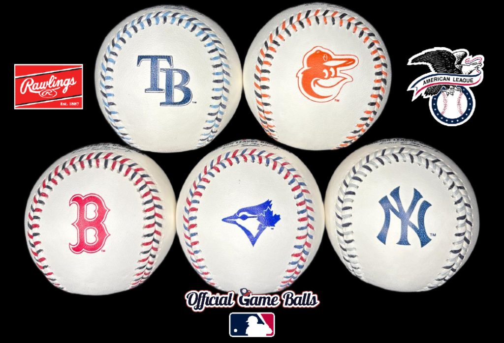
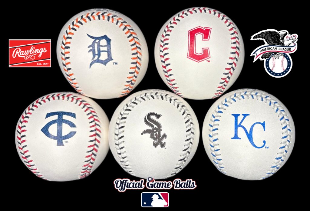
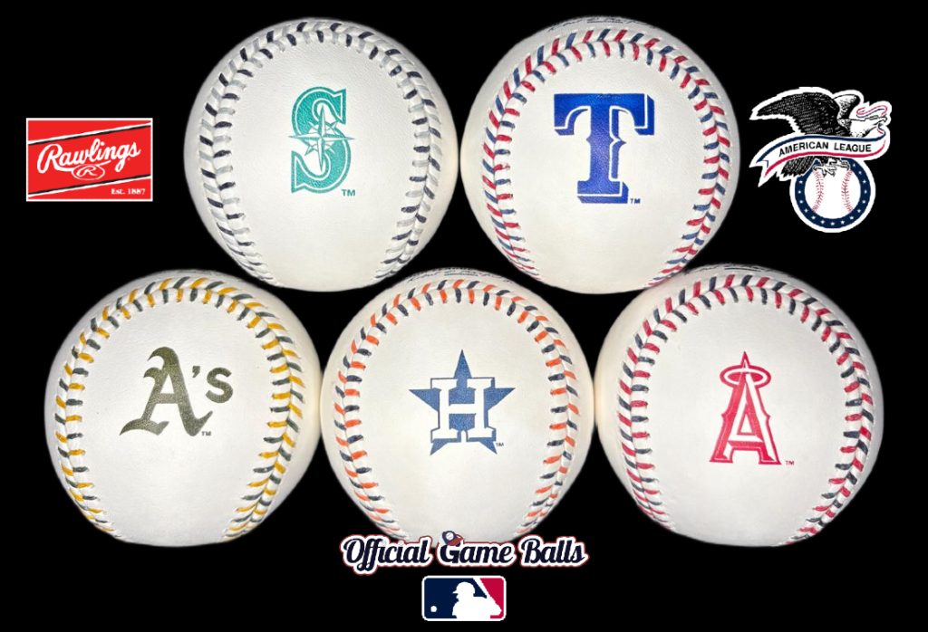
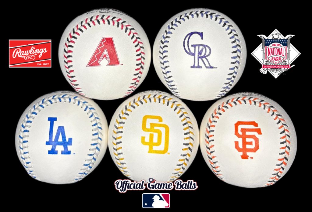
We’ve photographed all 30 Rawlings official multicolor stitched, colorfully stamped baseballs. Official game ball and signed baseball collectors can now get a closer look at these full-leather, ROMLB-grade balls.
This feature showcase was made possible by our friends at Rawlings Sporting Goods. Head to the Rawlings dedicated ROMLBTS page to order your favorite team’s MLB Team Series ball.


“The Rawlings MLB® team series baseball is a very unique collector’s item. It’s also perfect for any baseball fan! These unique baseballs feature the same construction as the Official Major League Ball™ for an authentic look & feel.”
–Rawlings.com
The collection will be added to the esteemed Museum of Baseballs in its own dedicated gallery, soon. But we’re premiering each ball here first. Be sure to click each thumbnail for a higher resolution image:


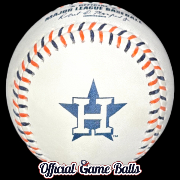
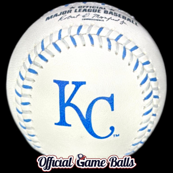
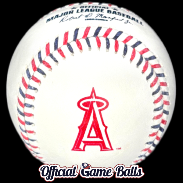

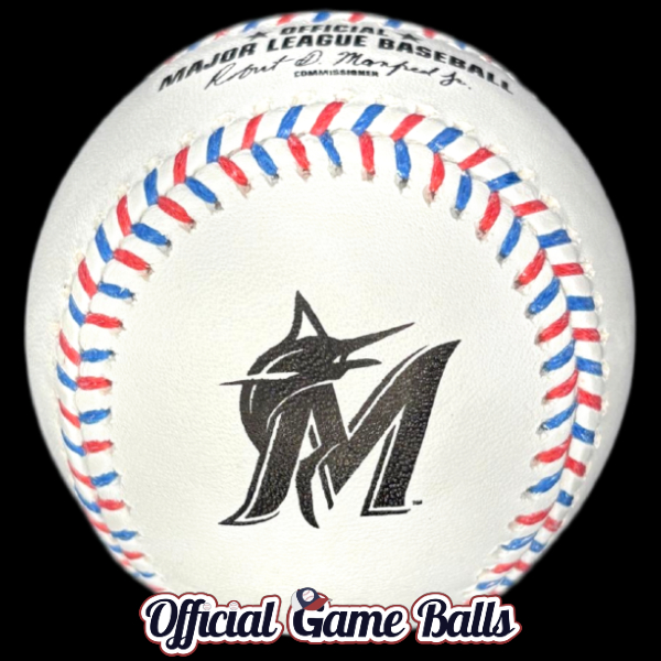


Now that we’ve got a proper look at real-life images and not just mockups and artwork, what are your thoughts? Did you notice there are two different base colors for the league stamping and Rawlings logo? They match up well with most teams primary logo colors, but not all.
Which are the best baseballs in the collection?
Any favorites? What stands out? My opinions haven’t changed much since developing the mockup images weeks ago. After editing dozens of new images of these baseballs, my order of faves – from awesomest to very cool to honorable mentions – remains about the same:
- Colorado Rockies (Black & Purple! 😮)
- Tampa Bay Rays (that stitch combo! 🔥 But the logo could improve.)
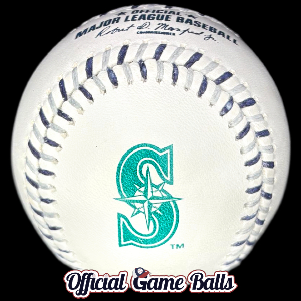
- Seattle Mariners (Best logo, plus one-of-a-kind ink color with solid lace combo.)
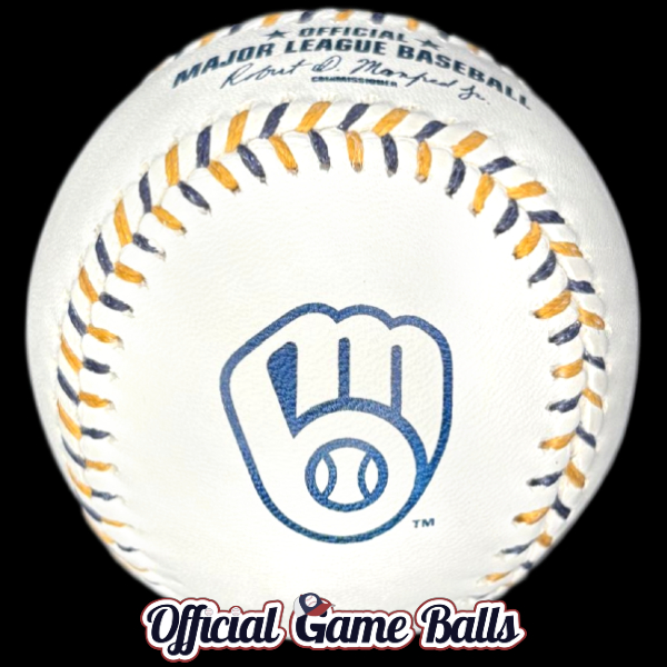
- Miami Marlins & Milwaukee Brewers (I just dig these logos! 👍)
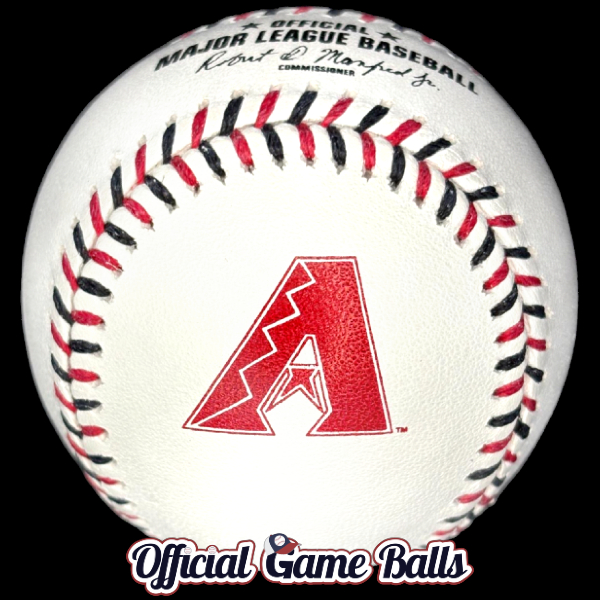
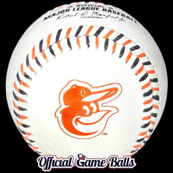
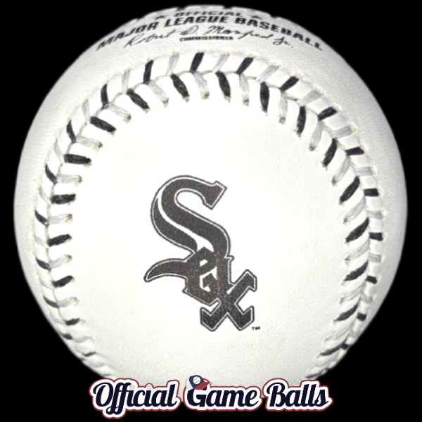
- Arizona Diamond Backs, Baltimore Orioles, Chicago White Sox: Simply clean and cool. The red D-backs logo plus red/black stitch? 🤌
Honorable mentions: Nearly out-of-the-park, ground rule double designs:
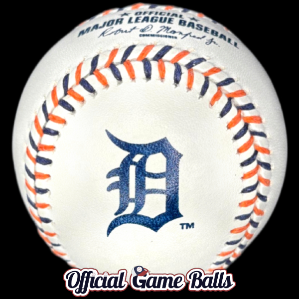
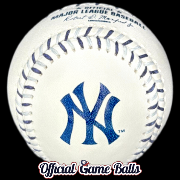
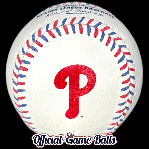
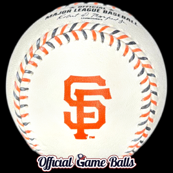
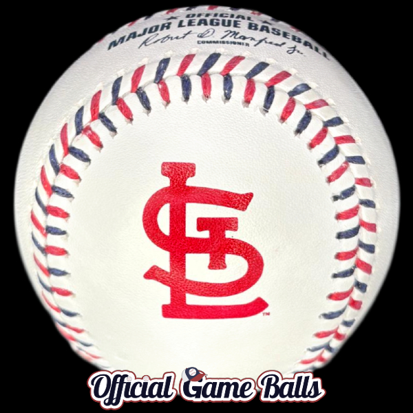
- I usually favor more detailed logos and artwork vs. minimalist letter designs, but these are all slick IMO: Red Sox, Cubs, Tigers, Twins, Giants, NYM, NYY, Philly, Cards.
- Sacramento / Las Vegas and formerly Oakland, KC, & Philadelphia Athletics: The A’s Green & Yellow is always fantastic. I’ve hoped to see a Major League gamer featuring these colors for decades. So I’m thrilled to have this one, but it’s been done better in the past in other leagues. See for yourself… Once in the Minors, with the MiLB Kane County Cougars’ 2007 Midwest League All-Star Game Ball. And it was done best in… Australia, mate?! That’s the first time green/yellow stitching was used in a pro league. That short-lived, obscure International Baseball League AUS ball is an absolute gem. I’d like to see this version’s green cotton thread look more… green. Perhaps it’s the wax coating thats blocking the color from shining through. We also have 2 other examples in the Official Game Balls Museum, but the green doesn’t quite pop here either: Forest City Owls 2024 ASG, and the Japan NPB Fresh All-Star Game Gallery features two examples from 2016, a game-used specimen and a minty fresh retail ball.
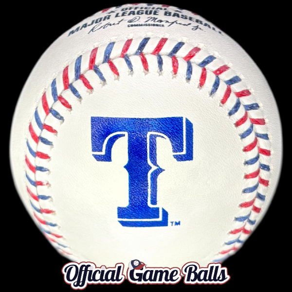
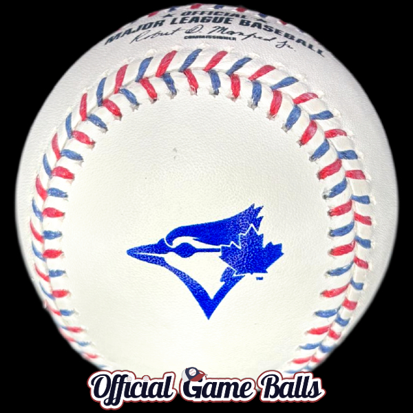
- Also that big, bold Texas “T” is working well. And if the Blue Jays logo was larger, it would be up there.
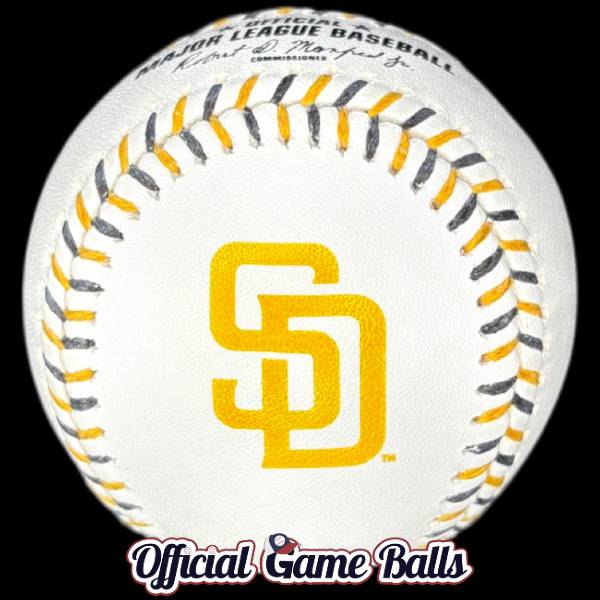
- One last Honorable Mention: The San Diego Padres. Finally brown & yellow laces! This needs to be seen in person though, and honestly, the brown lace could be improved; I expected this to really shine. It’s a little dull. I always regretted that the Padres hosted the 2016 ASG just before their full uniform rebrand to the franchise’s classic colors. It was a wasted opportunity for brown and yellow multicolor stitching with brown ink stamping. But we’re getting close!
What else can be improved?
These don’t need to change. The Team Series is a huge win. But here are a few ideas to consider if there’s ever a Rawlings Team Series 2.0 in the Big Leagues.
I question the use of standard dark blue and black base stamping for few of these baseballs. For most balls, the contrasting stamps really work. But it would help to try all-red stamping for red logo teams. If we can push further: green for the A’s, orange for the Orioles, and teal for Seattle would be terrific. That might require more setup, production and turnaround time however.
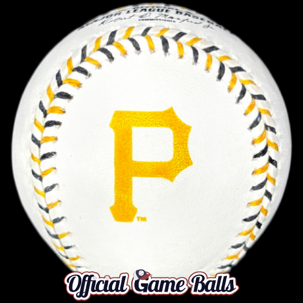
I think yellow ink stamping leaves a lot to be desired. As mentioned earlier, San Diego’s yellow would be much better if swapped for brown ink. And then there’s my lowly Pittsburgh Pirates…
So, how about multicolor ink stamping next round?
In a total dumpster fire of a season, I think Pittsburgh also has the least appealing Team Series ball. It’s fine, but it just cannot compete with the many All-Stars in this collection. And I love black and yellow laces. The combo was especially cool when it premiered on the 1994 MLB All-Star Game ball. But that entire baseball design was a knockout: black ink and the best MLB ASG logo ever designed (perhaps I’m biased, so what?). Unfortunately, cool multicolor laces cannot save that yellow ink and the simple “P” logo. For what it’s worth, I dig the basic Pittsburgh “P” on the Buccos black 5950 fitted caps. It’s just not working for me on white leather. With a simple tweak—a black outline? It could help a lot.
Imagine some of these logos with in 2-3 colors instead of one. That could kick it up a notch. Are there any objections? Perhaps we’d stray too far from traditional ROMLB-grade baseballs? I feel it would be worth it to experiment. If Rawlings keeps innovating commemorative retail balls, perhaps we’ll eventually see some improvements make their way onto official on-field special event gamers too.
Well done Rawlings & MLB
We’ve been very critical of Major League Baseball’s far-too-corporate and minimalist approach to logo designs for years. Thanks to this new Rawlings Team Series, we were given 30 reasons to think positively and feel inspired again. It was awesome to unbox and photograph all of these colorful beauties. This collection rocks!
We tip our New Era 59FIFTY Fitted caps to Rawlings and MLB for producing something so special for our little niche hobby, and more broadly for autograph collectors and casual fans. I hope Rawlings will continue on this path. Perhaps they’ll create a throwback collection in a few years? They could get really creative with vintage logos, stamping and designs. We have some cool ideas to propose… 😎

Want a digital copy of our Rawlings MLB Team Series posters? Or hi-res images of any baseballs? Please follow us on Instagram and send a direct message, or you may email us at info(at)officialgameballs.com (swap the ‘at‘ for an ‘@‘). Would you prefer a version without our watermarks and URL? Send us an email or a direct message in X, IG or FB to discuss.